Redesigning the Job Search Experience for International Students
Platform
Web Application
Model
B2C
Category
Job Search
Year
2024 - 2025
Context
Project Overview
This project was a 6-month collaboration with the job-hunting platform focused on international students from Eth Tech company. The team aimed to improve engagement and usability through a full UX and UI redesign. The platform targets a specific audience with unique constraints during job hunting, such as visa sponsorship requirements and limited timeline.
Responsibilities
I served as the sole product designer, leading the entire Double Diamond process, including user research, flow definition, wireframing, UI design, usability testing, prototyping, and iteration.
Collaborations
Product manager, backend engineers, marketing analysts.
Tools
Figma, Miro, Google Form, Google Sheet, Protopie
Timeframe
Six months, structured around the Double Diamond framework.
Challenges
Product Challenges
According to the internal data from Product Manager, from June to September it showed critical drops across key metrics: Daily Active Users decreased by 18%; Conversion rate from search to apply dropped by 15%;Abandonment rates rose steadily; Retention and engagement continued to decline.
Design Process
The very initial goal
As shown in the figure below, this was the initial page design of Eth Tech. Developed using Bootstrap without proper design structure, the previous website struggled to resonate with users. And the team believed that the declining metrics were primarily due to the site’s outdated look and lack of a youthful, engaging tone. Based on this assumption, I was brought in to redesign and upgrade the overall design language
Design Process
Double Diamond Model
I followed the Double Diamond framework to guide the entire project. This process helped ensure that every design decision was grounded in user research and systematically refined.
Discover: Identified problems through surveys, interviews, and competitor analysis.
Define: Synthesized insights into clear pain points, personas, and design goals.
Develop: Explored ideas through sketches, wireframes, and early testing.
Deliver: Refined high-fidelity designs and validated features with usability tests.
understand our user
Competitor Analysis
I did researches on four job platforms—two with broad job coverage and two more student-focused—to understand current market offerings for international job seekers. Using SWOT analysis, I evaluated each platform’s strengths, weaknesses, threats, and opportunities. While some provide comprehensive listings, visa tags, or STEM-focused roles, most lack consistent user flows, clear visual hierarchy, and tailored features for international students. These gaps create an opportunity to combine targeted H-1B filters, student-first tools, and modern, trust-building design to improve usability, engagement, and application conversion.
Target Audience
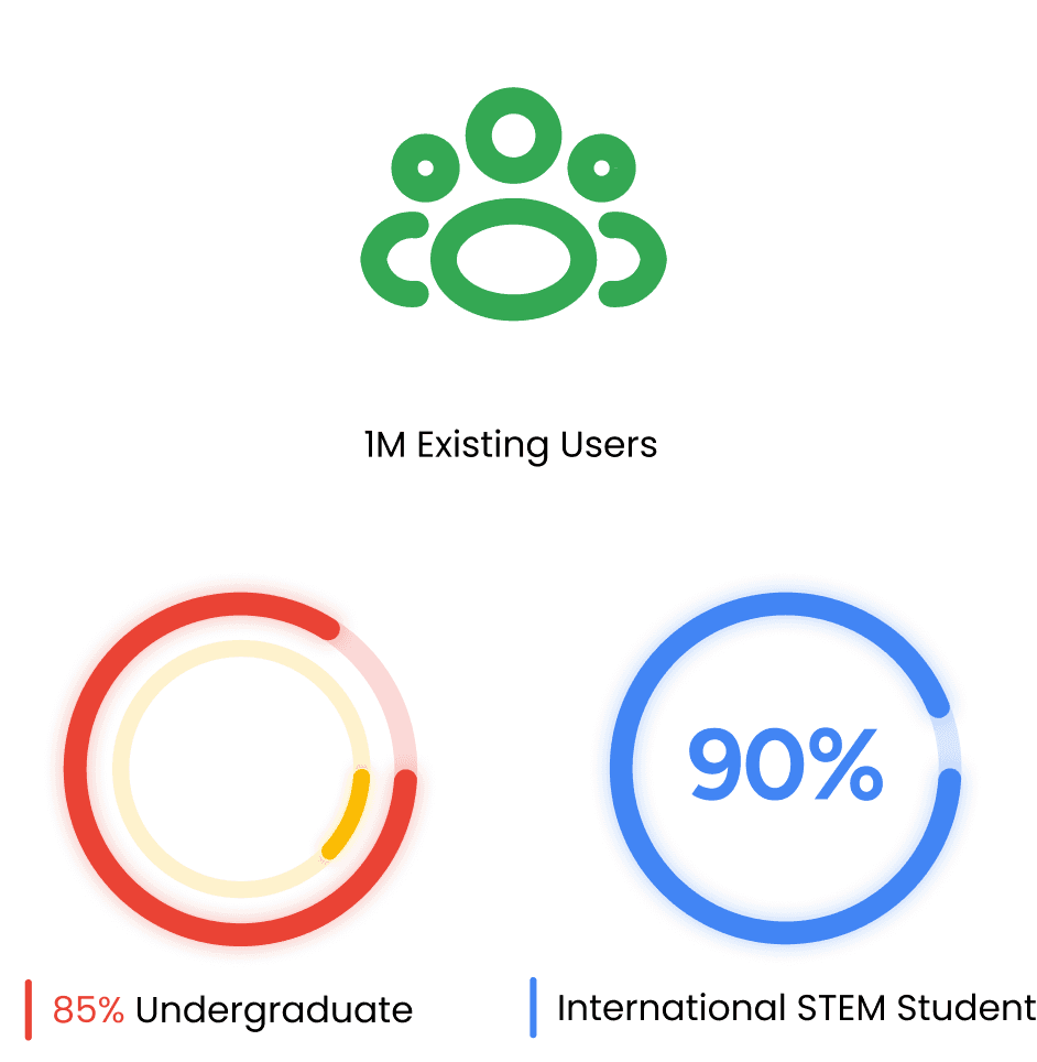
Eth Tech job posting website has around 10,000 active users, with 90% international students. Most are in STEM fields or aiming to transition into STEM careers. 85% are undergraduates and 13% are graduate students.
Primary: International STEM undergraduates seeking full-time jobs after graduation
Secondary: Non-STEM students looking to transition into STEM roles
Interview Insights
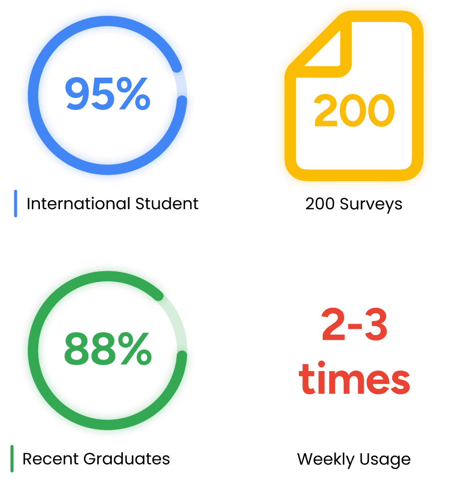
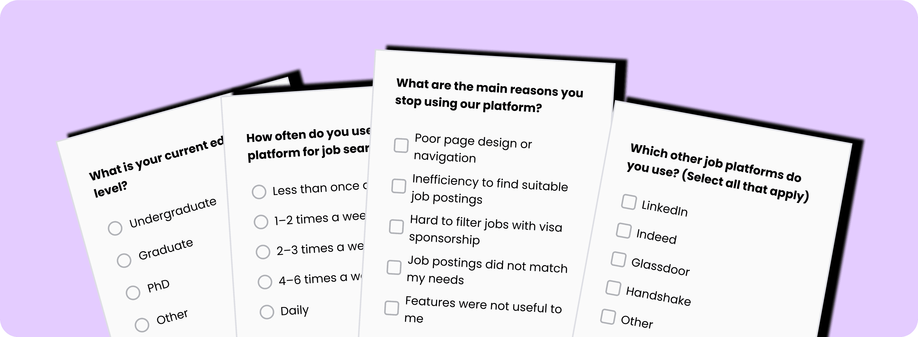
In 25 user interviews, 96% were international students and 88% were recent graduates or about to graduate. Participants valued our website for its immigration information, which general job platforms like LinkedIn and Indeed do not provide.
However, the drop-off rate while using our site was notably high. When asked where they went after leaving the platform, 92% visited USCIS or similar sites for company sponsorship history, 97% applied through external portals, and 80% tracked applications in Excel, Google Sheets, or Notion. The main reasons were the lack of a direct application portal and a job tracker that felt incomplete and hard to customize.
Define the main problem
Affinity Mapping
To make sense of the survey and interview findings, I worked with the UXR to organize all data into an affinity map. Insights were grouped into three key categories: user pain points, user needs, and market opportunities. This visual clustering helped reveal patterns across feedback, such as recurring frustrations with visa information, inefficiencies in job search, and unmet needs in application tracking. The map served as a shared reference for cross-functional discussions, ensuring everyone aligned on the core problems and opportunities before moving into ideation.
Personas
To make sense of the survey and interview findings, I worked with the UXR to organize all data into an affinity map. Insights were grouped into three key categories: user pain points, user needs, and market opportunities. This visual clustering helped reveal patterns across feedback, such as recurring frustrations with visa information, inefficiencies in job search, and unmet needs in application tracking. The map served as a shared reference for cross-functional discussions, ensuring everyone aligned on the core problems and opportunities before moving into ideation.
recalibrate our Goals
With the research insights consolidated, I collaborated with the product team to recalibrate our design goals. We shifted from the initial assumption of a purely visual redesign to addressing the broader need:
“Improving the end-to-end job-seeking experience”
After aligning on the goal, we established clear design priorities that would guide the upcoming ideation phase.
ideation
Addressing What Matters Most
Based on research insights, I brainstormed and organized potential feature solutions to address key user pain points and market opportunities. These ideas were evaluated against user impact, feasibility, and alignment with business goals. The initial focus was on improving visa-related information, streamlining job search efficiency, reducing the learning curve for career switchers, and simplifying application tracking.
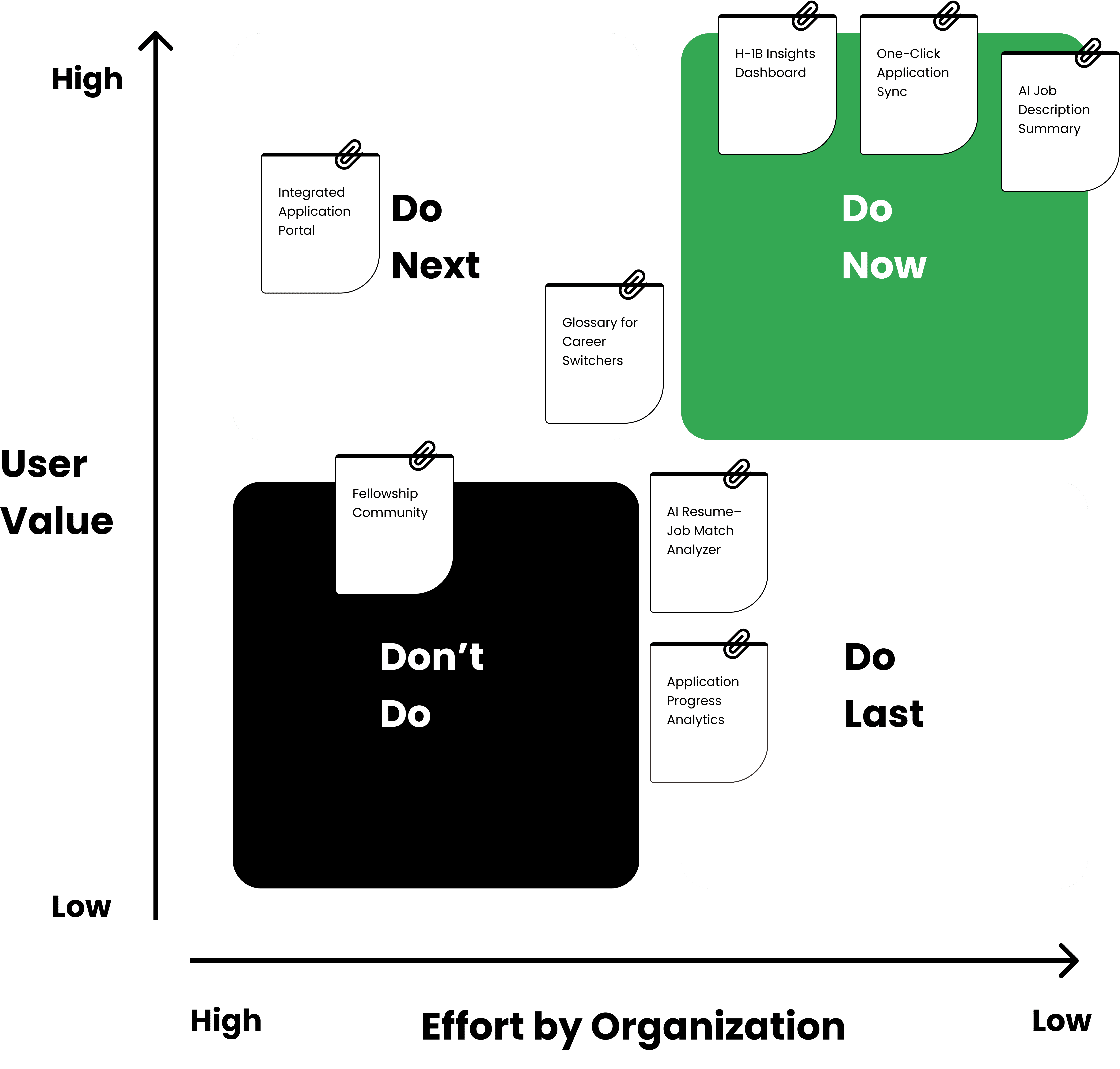
Feature Prioritization Using Matrix
To evaluate and prioritize potential solutions, I plotted each idea on a Feature Priority Matrix based on two dimensions: user value and implementation effort. This approach allowed the team to visualize trade-offs, identify quick wins, and plan phased delivery.
Mapping User Flow
With the top-priority features identified, the next step was to map how they would fit into the user’s real journey. I translated each idea into actionable steps within the job search process, ensuring they worked together as a cohesive experience. The red-framed sections highlight features prioritized in the previous matrix exercise, now placed within the full flow to visualize their role in the journey. By mapping the end-to-end flow, the team could anticipate user decisions, streamline key interactions, and ensure every high-value feature was seamlessly integrated.
prototyping
Sketch
After mapping the user flow, I sketched four key features to visualize how users move from search to application. These sketches then guided the wireframes, where the designs are shown in clearer detail.
Wireframes
The wireframe phase focused on translating user needs into tangible design flows.
On the homepage, new panels for AI Summary and Company H-1B Insights were added to help users instantly understand job relevance and visa eligibility
Technical terms in job descriptions could be hovered to reveal quick explanations and links for deeper learning.
To simplify applications, an internal apply modal was designed so users could submit resumes directly without leaving the site.
Finally, a new Application History page introduced a streamlined way to review and sync selected records to external platforms or export them as files, ensuring the entire job search and tracking experience felt seamless and efficient.
Hi-Fidelity Design
Redesigned Home Page
Building on the wireframes, I created the high-fidelity homepage design, keeping the rounded navigation and search bar for visual consistency. The new layout adopted the brand’s color palette and tone, while strategically placing the new features on the right side of the page—allowing users to explore added insights without interrupting their natural reading flow of the job description.
The internal apply flow kept the core structure from the wireframe but introduced step indicators and a refined information layout, helping users clearly understand each stage of the process and feel more confident as they submit their applications.
Sync to Tracker
Building on the wireframe, the application management and export interface was enhanced with platform icons and stage illustrations, making it easier for users to recognize where they are in the export process and feel more confident along the way.
test
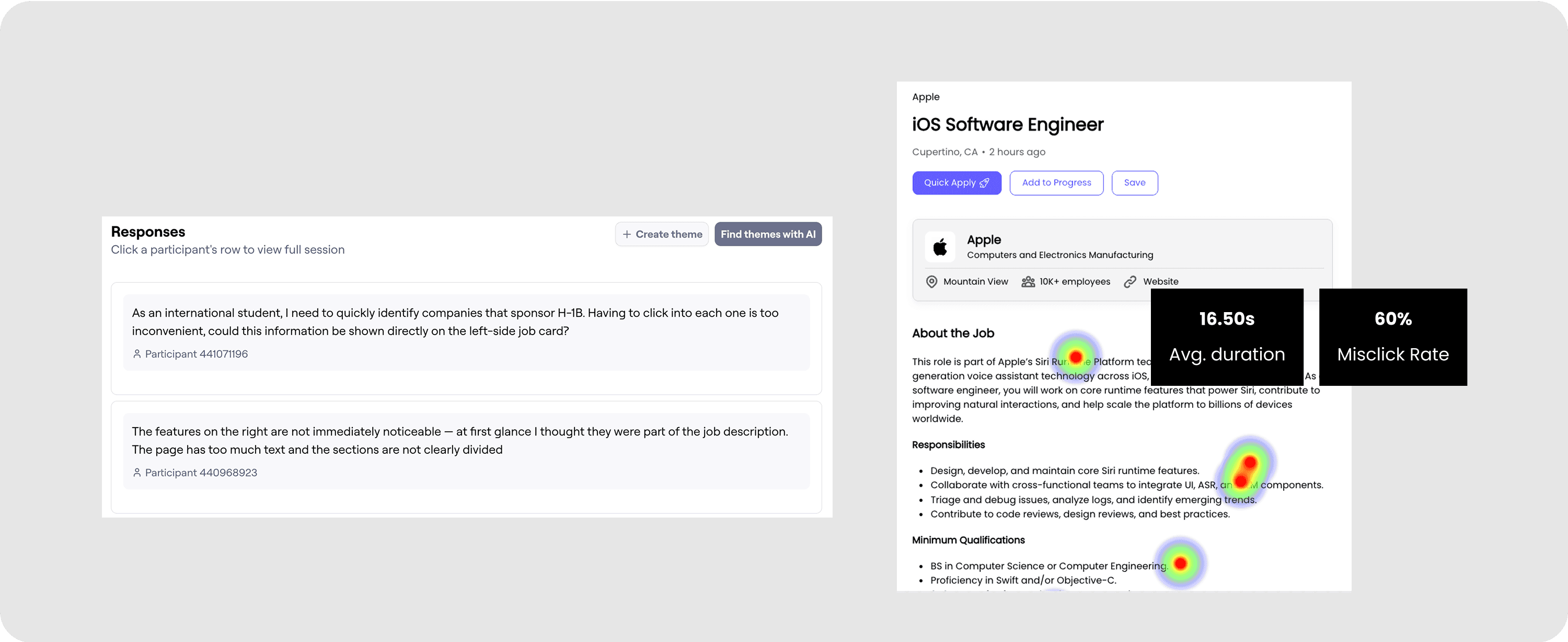
On Maze, I tested the existing high-fidelity prototype by designing tasks for users to complete. These tasks were created to let participants try out the newly added features.
During the test, I observed how long users spent on each task, where they paused or struggled, and gathered their direct feedback. I then summarized these insights and applied them to guide the following design iterations. (The figure below shows screenshots from Maze results, including user feedback on the entire high fidelity design flow; the heatmaps of clicks on the glossary feature, as well as data on page duration time and mismatches.)
What is going to be Interated?
After several rounds of usability testing and stakeholder interviews, I refined the high-fidelity design through multiple iterations.
Key updates included:
Sidebar redesign – softened color contrast with a subtle gradient and improved text hierarchy for easier reading.
Glossary enhancements – aligned button and pop-up colors with the brand palette, clarified text hierarchy, and replaced icons with more intuitive visuals.
Job card updates – refined the H-1B tag icon for clarity, added bordered highlights for visual comfort, and optimized text hierarchy.
Internal apply window – reduced unnecessary whitespace, focused visual attention, and added bordered states to highlight successful uploads.
Application record cards – improved text hierarchy for readability and added arrow buttons to clearly indicate interactivity.
impact
the encouraging changes
The redesign delivered measurable improvements across both business and user experience metrics, which validated the effectiveness of a user-centered, iterative design process and demonstrated tangible value to both end users and the business:
• Improved conversion rate by 17.2% after introducing a streamlined job search-to-apply flow.
• Increased user satisfaction by 9.8% through consistent design system updates and polished visual language.
• Successfully launched 3 MVP features from 0 → 1 (AI job insights, application tracker, glossary), ensuring smooth product reviews and adoption.
• Enhanced design workflow efficiency by creating and maintaining a Figma design system, covering iconography, grids, and reusable components.


